2025
Antipolis, Genève
Antipolis est une ONG basée à Genève, qui s’occupe de traduire et de rendre accessibles sur son site des articles internationaux traitant de questions géopolitiques.
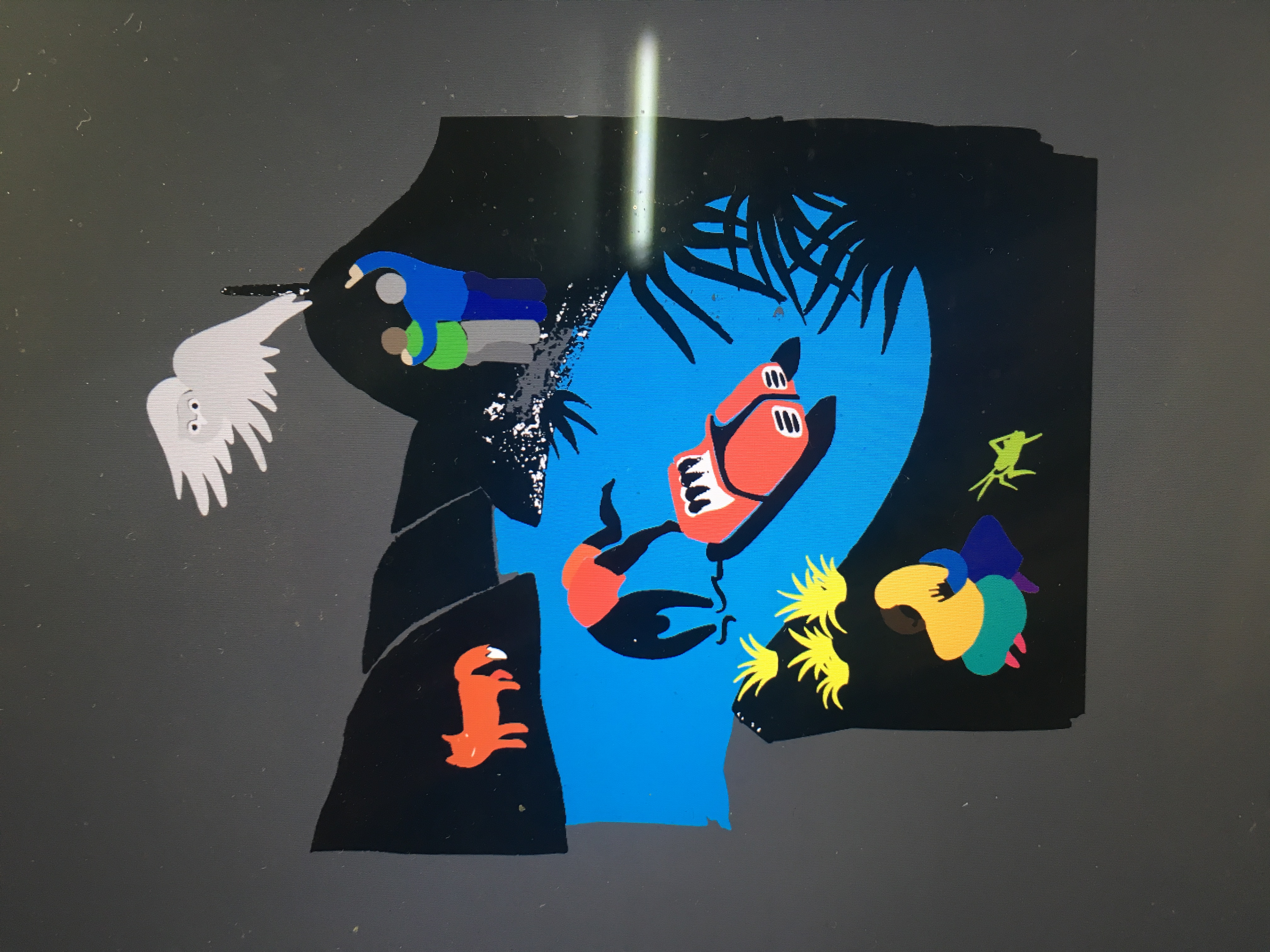
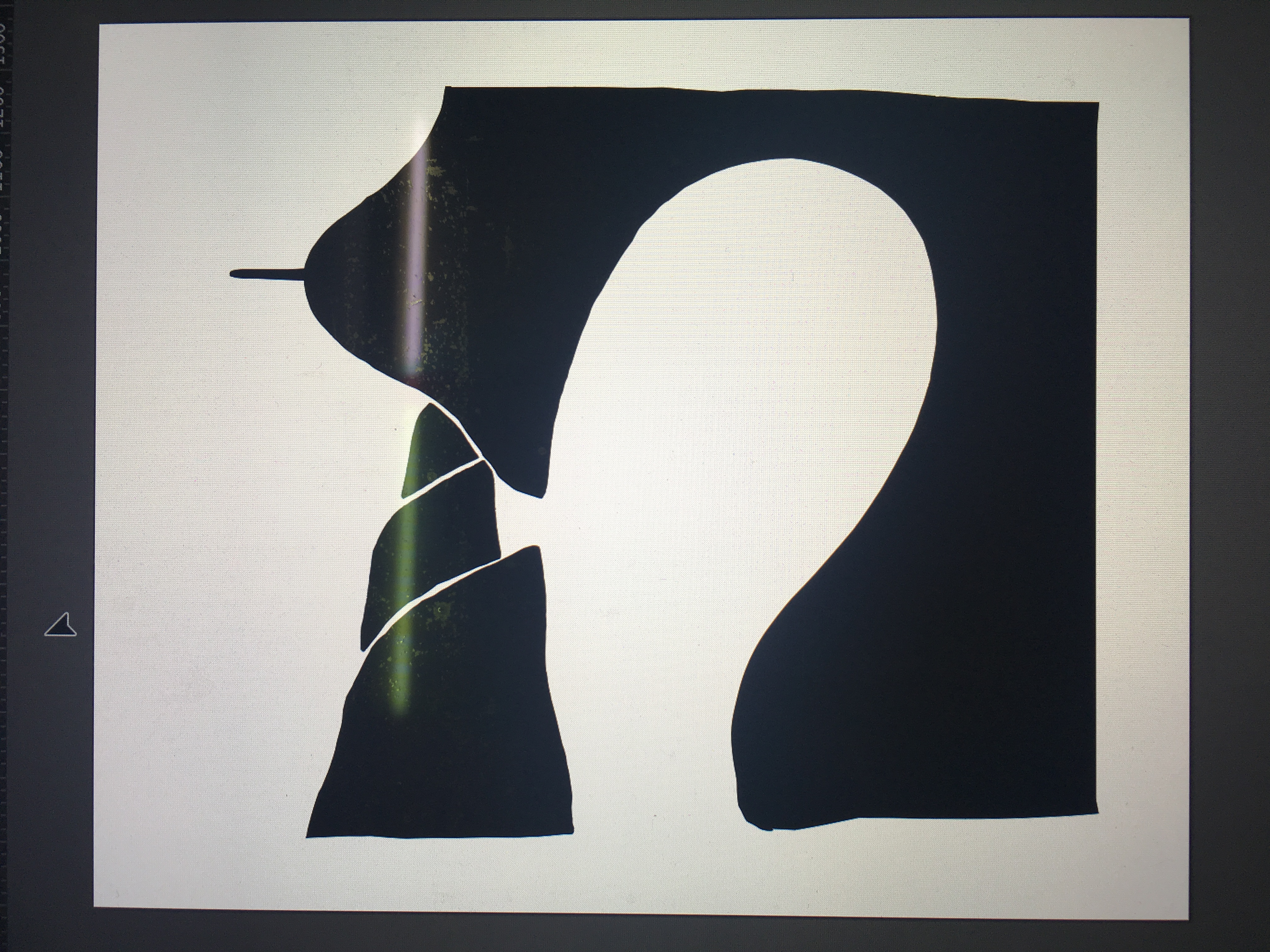
J’ai été invitée par l’organisation à concevoir une affiche sur le thème de la « transition climatique juste » à l’occasion de la conférence COP30 à Belém.
J’ai choisi d’utiliser certains symboles historiques des luttes populaires : des bras levés, des poings serrés, des visages à l’expression à la fois méfiante et en colère. J’ai également décidé de placer le soleil — victime et non responsable du réchauffement climatique — du côté de celles et ceux qui réclament justice.
Dans ma région, on dit que « le soleil est le manteau des pauvres ».
Alors que je travaillais sur cette image, il m’est revenu à l’esprit qu’il existait peut-être une pochette de disque construite de manière similaire. Quelques jours plus tard, j’en ai eu la confirmation : Uprising.
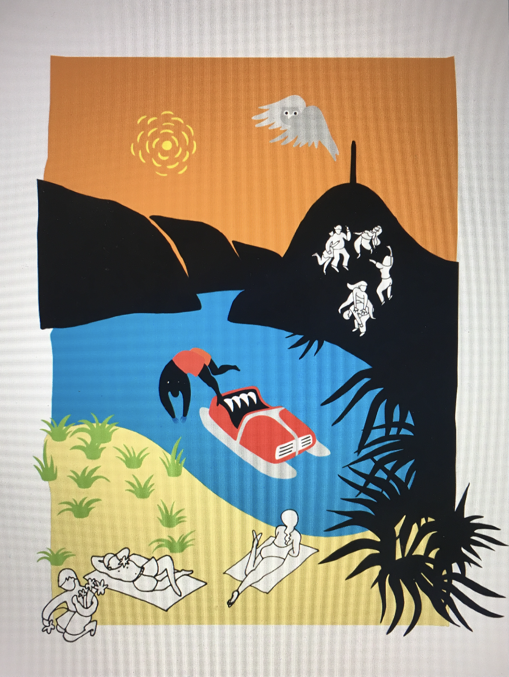
2021
Cliente privato
Illustrazioni raffiguranti il golfo di Lugano per pubblicità su quotidiano. Progetto su invito, non pubblicato.
Gli stereotipi possono anche essere divertenti!


2023
2024
2025
2026
Pro Natura Ticino
For Pro Natura, I worked across illustration and graphic design on a range of projects including the Animal of the Year campaigns for 2024, 2025, and 2026, with the latter to be announced on January 2nd, 2026.
The collaboration also included the design of the membership brochure, the Bellinzona hallway poster, stickers, and exhibition posters, as well as the 2024 T-shirt and the upcoming 2026 edition. Alongside these visual outputs, I provided ongoing consulting services, contributing to the development and continuity of Pro Natura’s visual language.


2023
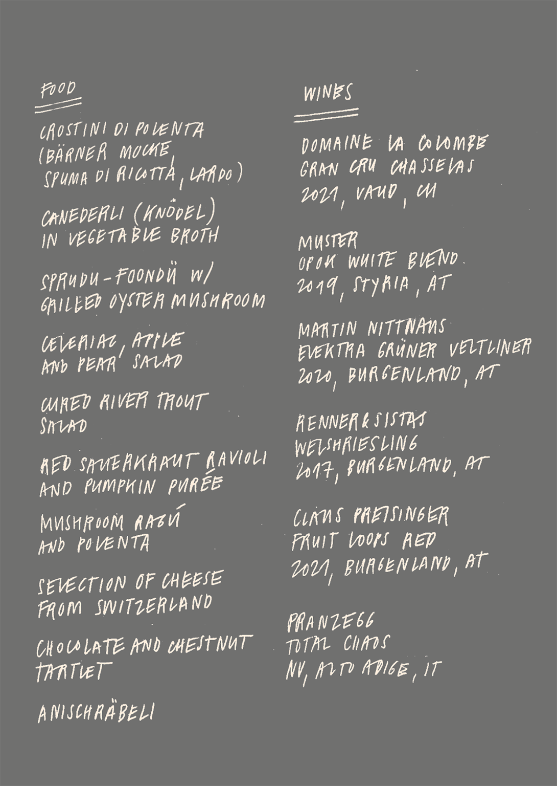
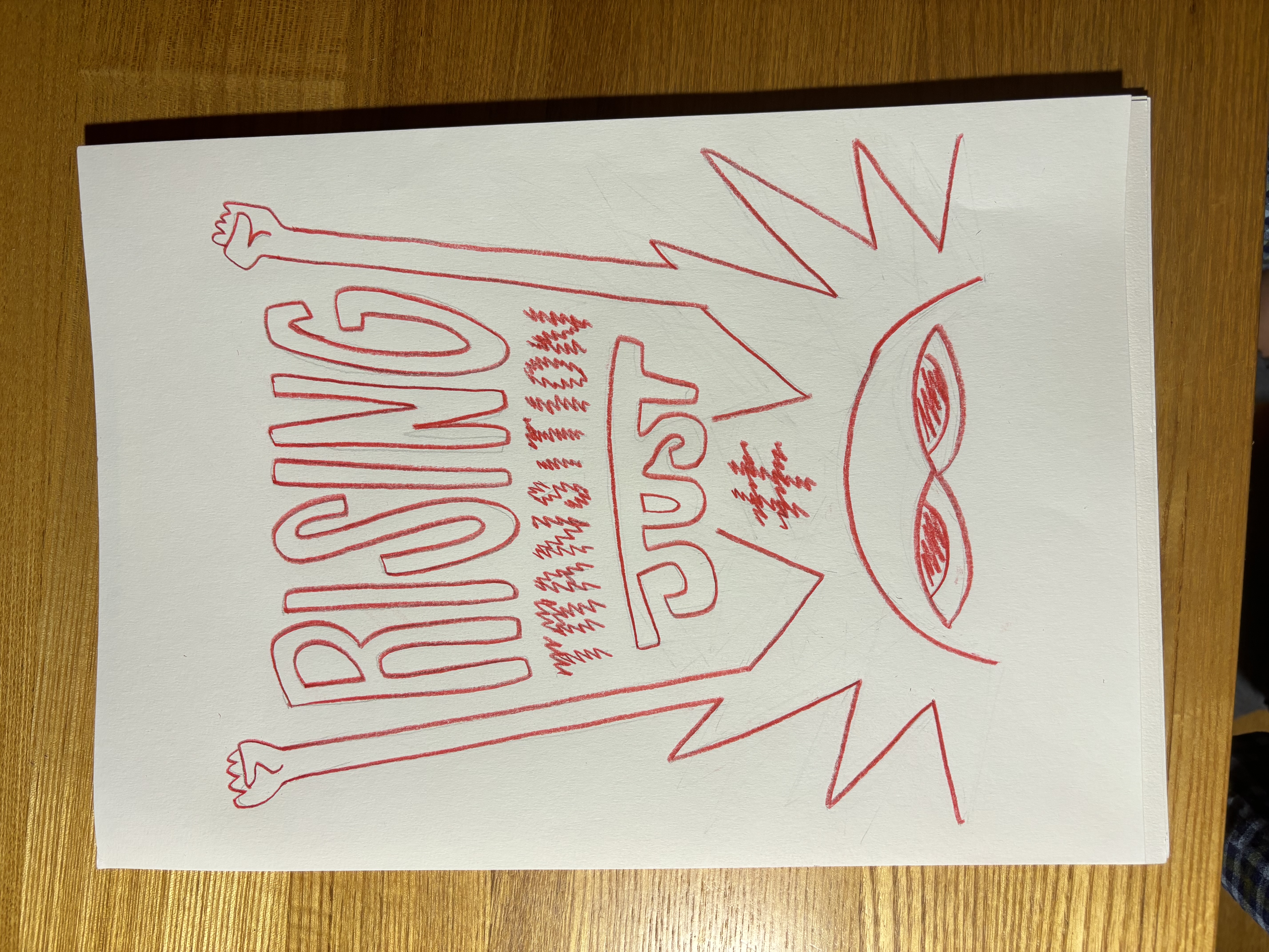
A Tavola, London
“Alpine food & wine” dinner menù.
The illustration is inspired by a (then) recent walk I had up on a South-swiss mountain. The stile is meant to remind of Anisbrötli and butter, two core element of an alpine way of life.
The illustration is inspired by a (then) recent walk I had up on a South-swiss mountain. The stile is meant to remind of Anisbrötli and butter, two core element of an alpine way of life.
The menu is handwritten in my (also then) calligraphy, and it reminds both to recipes and hand-carved letters on wood